Digipak Mock Up

In the top left I have my front cover, top right is my inside left cover, bottom left is my inside right cover and my back cover is in the bottom right.

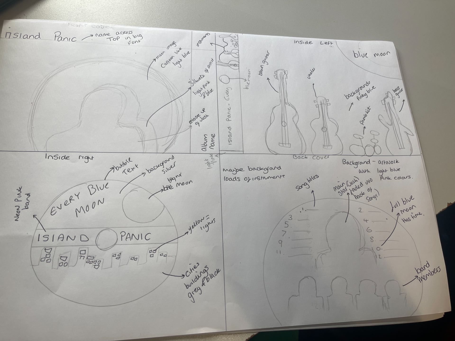
After doing research on what are conventional and essential elements of my digipak with my chosen genre, I have created a mockup on paper of my original ideas that I have been developing using the conventions of an indie pop digipak.

Front cover 

Due to the album name ‘Every Blue Moon’ I decided to have a big edited moon in the centre of my front cover with the star image reflecting onto the moon with a silhouette of the artists. Due to me having a band playing I chose the lead singer of the band to have on my front cover. Due to the genre indie pop it is important for me to tie in both repertoire of elements of each genre. For example tying in my artists on the front cover which is traditionally pop as well as tying in some artwork which is more indie. The colours I will be using are primarily blue and pink mixes of neon and light tones. 

Inside Left:

On my inside left cover I have the constant throughout the blue moon however only in the top right corner of this side. I have included the instruments which are common among indie bands ideas. I am going to incorporate more artwork into the inside left cover, however not sure how at this stage. 

Inside right:

This is where the CD of the album will sit on the CD I have printed onto it the band name and the album anime across the centre. A city which will be more animated then images of a city. The common theme of the moon appears due to the album name. The colours I am using on this page are darker, black and grey on the CD as well as the band with the album and bands name being bright pink to stand out. 

Back cover:

Using the conventional elements of a back cover of an album digipak. I have the same design of the moon being the focus, however the moon being more faded and not as prominent towards the bottom of the image as this is where my band’s faces are going to be. The colours for this sector of the digipak are blues oranges and cool tones for the back of the digipak. The songs on the back include:

  1. Blue Moon 
  2. Best Day Of My Life
  3. Melody 
  4. Diamond 
  5. Believer 
  6. Hit It 
  7. Pride 
  8. Go Big Or Go Home 
  9. Brightest Star 
  10. Luck 
  11. Angel 
  12. What We Live For


Colour Swatches:

These are the colours I would like to use in my Digipak.

Digipak Conventions Analysis

As you can see from below we had to choose an album cover that matches the genre of our artist and label the repertoire of elements that are conventional for a Indie pop albums blueprint cover and digipak. 

For example every album cover has:

  • The artists name (usually on the front cover of the album cover)
  • The name of the album on the front cover 
  • A barcode 
  • Small copyright terms and conditions for legal reasons 
  • The tracks in the album printed and listed on the back cover

As you can see from my connotations and explanations of the album cover I chose a slightly different one as it has some very unconventional parts to it. For example the text is very small on both sides of the album as well as the Name of the artists isn’t on the front cover but on the back in small writing. I highlighted this while looking at the album due to the nature of it being unconventional.

Indie pop is a different type of music as it combines the indie side with the pop side therefore with indie albums you can usually expect a piece of artwork on the front but not the artists, however with pop you always have the star image on the front cover. Therefore Clario’s album ( the album I chose) is a combination of both but more pop due to her being on the cover.

The language in the media is very important as it tells a story and is very conventional to my chosen genre. This research and analysis will help me to create a succesful and conventional digipak for my band.


Digipak And Mission Statement

We found in this task that In order to have a star image that blends with your brand and genre you have to do research on the genre they are part of. 

This included selling our barn and our star image, understanding our competition and being aware of what they have done/ are doing, having a mission statement that reads well and is effective, making the audience want to know more about the artist and finally how you are going to sell your brand or star to the target audience.

Before we started coming up with our group/band/artists name we had to first of all think, who is our audience? Who listens to indie-pop music? And who are we targeting this brand at? After some research we discovered that most age groups that listen to indie-pop music are ages 15-21 so therefore in full time education or not long out of full time education. We took this on board when discussing our marketing strategies.

We decided for Island Panic we are going to use integrated advertising this means we are using multiple platforms of social media and industries to create the most efficient and successful audience for our package. We are also going to use guerilla marketing, we were also thinking of doing a call to action in our digipak to make the audience want to engage. Obviously when we were thinking of this we were making sure it all fits with the genre and is  coherent with other artists’ work as we wouldn’t want the audience to reject the text. These are our USP ideas and strategies. 


The Look book

Made with Padlet

This lookbook connotes what our genre of music for our band Island Panic is all about, these images we found connected to the style of music and the Bands branding. Some of these images are integrated advertising pieces of artwork.

While doing this tasks we realised we didn’t know much about the genre therefore we had to do some research on Indie pop music, the main connotations to having a successful indie pop brand the repertoire of elements are as follows:

  • simplistic artwork
  • Bright colours 
  • Emotional 
  • Tells a story 

By now knowing and understanding the conventions of a successful indie pop art piece whether it be a vinyl, album cover or music album cover, we can use this information as inspiration for our pieces of work in this module. We like some of the artists on the look book wall who will be using integrated advertising to appeal to the maximum audience we can. 


Draft 4

This is our 4th draft of our music video which has various improvements form the last feedback and daft 3. These improvements include:


  • Cut to a close up as soon as he starts singing
  •  included more close ups of the instruments
  • Included more close ups of the singing including a reshoot of close-ups
  • corrected sequencing of animals
  • corrected the guitar playing
  • Zoomed in on fingers moving to add more context
  • cut into action more 
  • added quicker cuts as the music video progresses
  • corrected repeating shots
  • re-framed the animals cheering
  • fixed the 180 rule


Also from our draft 4 we got additional feedback from multiple people studying the same course as us, this feedback is below:

‘I think you did a good job with the variety of shots and distances particularly your narrative film. Your video also includes MES which goes with the genre and general feel of the music. However some things I think you can improve on is having more prominent lip syncing to allow the viewer to see the actor singing the song. I have noticed there are some parts where you are not cutting to the beat of the music.’ Travis 

After watching your music video, here’s some peer feedback:

What Went Well:

  • You have included some great shots of the band in the performance.
  • I especially liked the editing of the color-changing shirt to the beat.
  • I understood the narrative at the beginning.
  • Great mise-en-scene; use of animal costumes and setting of a real estate agent.
  • You executed the transition from the guitar to the performance really well
  • Good use of various camera movements and shots taken from different angles/distances.

Improvements:

  • Black cuts are the beginning are distracting and don’t add much to the video.
  • Didn’t understand the significance of the posterize, cartoony effect on animals.
  • Some blank bits occurred, but I assume you are planning on adding in more clips.
  • There’s a clip, a close-up of the bass guitar, where there is no movement of the performer playing it at the beginning when the music is playing; so maybe cut the beginning of that clip so that the performer is consistently playing it.
  • Girl running away – the color changes in the clip of the slow-motion run so make sure to apply the same attributes to both clips.
  • Clips at the end need stabilizing.

But overall it was a good video.

Lana DG

  • On genre, all costumes match each other. 
  • All shots are steady, and the pans are stable too.
  • Some lip syncing but could be more consistent and constant throughout video (more close ups)
  • Variety of locations for performance and narrative which all link to the story well. 
  • Add more close ups for the performance scenes, cut in and out of close up more frequently. (in our video we used the crop tool if we didn’t have a close up filmed)
  • Multiple angles concerning the animals and when the young girl is playing with them, this adds depth and conveys the genre. 
  • Although you move locations for the performance the angle is always straight on. Could you add any side angles of performance or low/high. 
  • I think there is a good amount of movement in the narrative which tells the story line. 
  • Acting of animals and the young girl tells a credible story. 
  • Shorten the clip of the girl ripping the paper – as you see that she drops it.
  • A good amount of close up shots for the instruments.
  • Plenty of long shots throughout.
  • You could also add some close up shots of maybe the animals feet as they walk ? To add more variety. 
  • More close ups – use the crop filter if there are none filmed, we did this frequently in our video.
  • A variety of instruments used and edited to the beat well.
  • More close ups – use the crop filter if there are none filmed, we did this frequently in our video.
  • A variety of instruments used and edited to the beat well. 
  • The colour filter used during the ‘count in’ adds character and looks really good.
  • I think you could do more of these or something similar to add vibrance – maybe on the other clips of Emma to make it cohesive.
  • You have cut from clip to clip on beat, including where there is use of instruments. 
  • The transition using the ukulele is really good. 
  • Add more transitions using effects to make the movement between performance and narrative consistent. 

Costume and location.

  • Transition from one performance scene to another using ukulele.

Narrative and how the story line is addressed.

  • There is a clip of Emma where she is speaking/lipsyncing but it is not in time to the lyrics. (2:35mins

Jemima

We have taken all of this feedback on board and although we may not agree with every aspect of the feedback we have definetly found it helpful. We will take these improvments for our final draft.

PMA And Risk Assesment:

Above is our production meeting agenda and our risk assesment, this will keep us organised. This also helps everyone understand where they need to be and what they need to bring incase they forget. This also helps as we have everything when we need it and where they need to bring it. This would also help us as if our teacher needs to get hold of us we have the school phone number to gain contact easily. Our risk assesment helps us stay safe and elliminate any risks or potential hazzards during or surrounding the shoot.


Draft 3

In addition to our feedback from both specsavers and our teacher we have produced a draft three We have taken in the initial issues and problems with our draft 2 in order to improve our music video. 


As you can tell from our draft 3 some things we have started including are:


  • Adding contrast lighting in some clips 
  • Editing to the beat 
  • Using effects in places that may seem a bit boring at first glance 
  • Cutting down long clips 
  • Being initiative with effects and video cuts 


Screen castify:

As part of our new feedback on our draft 3 our teacher has produced a screen castify over the top of our video. This will be one of the last pieces of feedback we will be given, therefore it is important we use it to our advantage and edit our video using the following pieces of advice:

  • Cut to a close up as soon as he starts singing
  • Try and include more close ups of the instruments
  • Include more close ups of the singing including a reshoot of close-ups
  • correct sequencing of animals
  • correct the guitar palying
  • recreate fingers moving to add more context
  • cut into action
  • add quicker cuts as the music video prgresses
  • correct repeating shots
  • re-frame the animals cheering
  • fix the 180 rule