Language Analysis

The article

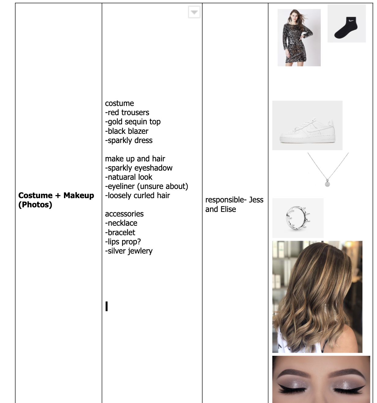
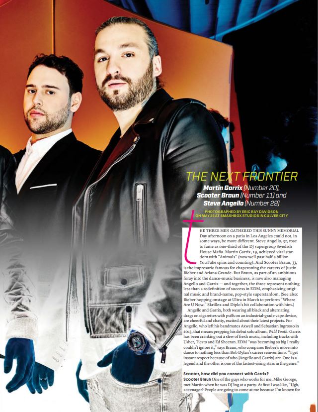
I am analysing the article by Billboard on a new boyband ‘The Next Frontier’ some of the coverlines also include ‘dance power players’. The author is Billboard, the photography was done by Eric Ray Davidson. The artists have been styled and are wearing various outfits and  Garrix wears a John Varvatos shirt, Joe’s Jeans and AllSaints jacket. Braun wears an AllSaints shirt and The Kooples suit. Angello wears a Feathers shirt, Dr. Denim jeans, Saint Laurent jacket and Hublot watch.

The target audience of this magazine is men aged 20+ as the text is hard to read and also includes explicit subjects such as cigarettes and vaping which wouldnt be acceptable for a younger audience. The article includes a link to an exclusive video interview with the new band, as well as behind the scenes information.

Structure

The magazine includes:

  • exclusive interviews
  • behind the scenes information and videos
  • quotes from other famous artists
  • photographs from shoots
  • main image
  • main cover stars
  • text box
Presence of journalist

We are aware of the journalist reporting however the magazine/article is in third person, we are made awear when the jounalist says that one of the guys who work for them met the star at a party meaning the author has a personal view and relationship with the interviewer. The impact this has on us as the readers is that is makes us feel connected to the story and the artists knowing private things about their lives. There is no clear introduction or conclusion to this article.

Language AND AIM

The author uses quotations in their work to add effect and to quote artists they want people to know have commented on the magazine or are included in the magazine. The writer also used quotes to quote the artists songs and albums. The writer uses phrases like

  • ‘redefinition of success’
  • ‘ becoming so big I really couldn’t ignore it,’
  • Garrix has been cranking out a slew of fresh music, including tracks with Usher, Tiesto and Ed Sheeran. EDM
  • “I get instant respect because of who [Angello and Garrix] are. One is a legend and the other is one of the fastest-rising stars in the genre.”


1st Draft Of Contents Page


Please click on image to see the PDF

Peer Assesment

What type of shots have been used to create a variety of shot distances and how has the camera been used to communicate meaning?  

You have used mid shots and close ups in your cover page which is effective as you can connect with the model as well as seeing what they are wearing. The camera being situated at eye level makes more of a connection to the audience and communicates the friendliness of the models.

What choice of Mise en scene is appropriate for the star image and genre?

The colours and outfits used reflect the pop genre well and portrays your star image as a real pop star. This is effective as it makes the magazine closer to a real one.

 How far is the font used readable and reflects the genre?

Your choice of font is very simple which doesn’t make the cover look too cluttered, the masthead being a different font to the main font makes it stand out which is particularly effective.

What technical conventions of a Contents page are present and used effectively?  

You have used a masthead, cover lines and cover stars in your contents page effectively so the cover lines are linked to the stars that are featured in the magazine. 

How has Indesign been used to layout the page to convey a brand?

InDesign has been used well to lay out the conventions of a magazine to make it seem like a real magazine. The placement of the masthead is also effective as it gives the contents page a sense of direction.

How well have the text and visuals been integrated together?

The text and images have been integrated together to link the cover lines about the stars that have been featured in the contents page. This is effective because then people know who the big topics are about.

Where has photoshop been used to manipulate the photos to enhance the star image or genre? 

Photoshop has not been used as the images have been placed in the shapes on the contents page making use of the studio background.

 How is the language used appropriate for the genre and target audience?

The language used reflects the pop genre well and aims the magazine as the correct target audience, this use of the simplistic language makes it easy for anyone to understand.

My reflection

I am pleased with my first contents page draft however I am aware of changes I need to make to my contents page to improve it and maintain a higher grade.

  1. Use photoshop to add make-up or touches on my models to show a higher level of skill
  2. Use more imperatives in my cover line
  3. make sure I have words that semantic field
  4. Change a couple of the fonts to fit my genre better
  5. Do a photoshoot with my models

By doing these five things my contents page will be succesful and reach the correct target audience.

Contents Page Planning

Content pages traditionally come after the front cover on the next right hand page. The function and purpose of a contents page is too add more imformation and to intise and interst (AIDA) the audience to read the magazine. Another purpose is the page numbers the page numbers make it simple to read the article you want read making that article more accesable. Every contents page should have these conventions:

  • Editors opinion and summary
  • Images and designs
  • Interesting and eyecatching coverlines
  • Page numbers
  • The magazines name and mission statement


Before I started designing my own contents pages I needed to gather ideas and inspiration from other contents pages. These contents pages I have seen on the internet and found attractive and unique. Some of these designs I like eventhough some are spread across two pages I can still take inspiration from these designs. By using some of the ideas on the slide I have created four handrawn unique designs  that I like and might use in my final magazine contents page. These four designs are below.

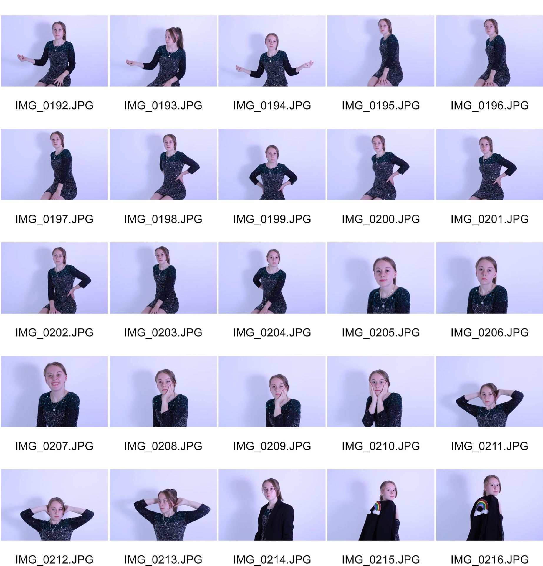
I chose to create these designs as they aren’t basic or easy designs they have a different level of attraction. I like how on the second design I have taken inspiration to overlap the image onto the other image. I also have come up with a fun idea where I am going to use 2 fingers snapping as my page number icon. This ties in my magazine as it is called snap pop. I knew designing my own contents pages I wanted them to look professional and also different from the standard content page. Now that I know what I like and dislike I can now start making drafts using my own images and text.

Coverlines:

Can taylor swifts new album make it to the top?
Can ADELE MAKE history with another no1?
harry styles recieves backlash for new song
britany speers harrased again for her costume choices
Little mix down to four members after the job got too much for one member


Draft 1- Front Cover – Self Assemsment

Please click on the image to see the PDF

This is my first draft of my magazine cover below there is my reflection which includes what I can improve on to make my magazine cover better. I have made my magazine for my target audience parcifically by the use of AIDA. The purpose of my magazine is to entertain and to give my target audeince a social interaction. I think I have done a good job at creating a music magazine for my genre of pop.

Masthead Designs

These are some of the masthead fonts I really like. In  my persoal opinioin all of the mastheads would look better if they were in colur this will be how I will imporve the mastheads as well as also catching the audiences eye. I dont like the last font as I feel it is hard to read and to understand I will not be using the last one for my magazine front cover. I like the 3rd font for my masthead however I feel it would look strange in colour and not stand out as the first 3 mastheads. The fourth masthead I do like I just think its not very pop style.


This is my favourite font and I am going to use this for my front cover, what I like about it is the way it is bubbled to catch the audeinces eye. I also like the colour pallete i chose a vibrant pink and blue. This font fits the genre very well being vibrant and big.

First Shoot Contact Sheet

These are the pictures that came out of my first shoot for my front cover. I like most of these images however the ones I like and am most liekly to use are:

  • 0174
  • 0205
  • 0208
  • 0213
  • 0216

My overall favourite that I will be using for my magazine is 0213 I really like the models positiioning an dher body language. With a bit of editing make-up on such as bright eye-shadow or lipstick it could look really pretty. I also have realised how not sparkly the dress is and how dark it is so I will have to do some editing ot make the dress sparkle and prominant in the image. However I need to be aware that this could mess with the lighting and make the dress look heavy edited and unrealistic.This image would be a great star image cover for my magazine, also by making the dress mroe sprakly and brighter it will make my genre more clear.

Front Covers Designs

I have put together a slide of 8 magazine cover I like the design elements of parts of the magazine I like include the:

  • colour pallets
  • formats
  • graphics
  • layout
  • photo manipulation
  • lighting
  • cover models style
  • cover model
  • coverlines

Althoihg I do like some of these features on all of the design I prefer how the artists is styled and modeled in some rather then others. This is all down to personal preference. For example I like the colour pallete and the way the model is postitioned but I do not like the models costume.

The seventeen magazine I like as the main cover star goes into the masthead and it makes the magazine unique. However I find the colour pallet a bit boring and not very vibrant. I also don’t like the colur pallete on the Essance magazine as it is vibrant but the main cover star is dissaperaring into the backgorund.

The Vouge and the Taylor Swift magazine are very classy and plain therefore I don’t like them as they aren’t very pop magazine colours. I like the font of the ‘Billboard’ magazine as it is very bold and bright.

Knowing what I like and dislike will now help me create a magazine not only that I like but also a succesful magazine that my target audience like aswell.

Production Meeting Agenda for 1st Photo Shoot

The preparation for the shoot should not be neglected as it is extremely important to prepare. Without preparing for the shoot you will become stressed and may not use the studio time to the best of your ability due to costume drama or any other issues that may go wrong.

By being prepared it will help me and my model know exacly whats happening and when, this will help us both prepare for the real world when we are doing shoots with professional models and producers.

Star Image- Theirs and Mine

How Adele is represented in the Media 

What I want my main cover star to look like

I have designed mood boards of what I want my magazine to look like and what props, settings, lighting,costume, hair and make-up and poses I will use. I have included why I like these props and what they will add to my magazine. For example the props I se will help me convey my story.

My genre is pop so I have chosen very out there clothing and eyecatching colours to help connote the pop genre.

Audience Profile

I researched 3 famous pop stars from the USA and UK, these artists are all well known. These snippings and charts show us important information whcih will help with my magazine cover and double page spread. The information will help me understand who my target audience is and what to include.

Adele

This chart shows that the fans of british pop star Adele are majority part of the conservative party. The conservative party are normally associated with the higher class. This shocked me as I would’ve thuoght that Adele fans would be majority Labour which ranged from middle class to lower classes.

Ariana Grande

Next I reasearched Ariana Grande on Yougov this gave me imfromation on her as an artist and her audience/fans. I found her main audience is gen X this is from people aged 9-24. By gaining this information I noticed most pop stars that are popular nows main target audice is gen x (aged 9-24). Now knwoing that gen X is the main target audinece for majority of the pop stars I can now call them my main magazine audience.


Justin Bieber

I used another famous pop star Justin Bieber as another star to reasearch. I found out his audience is 42% women which didn’t suiprise me as most male pop stars audience is more liekly to be mostly women then men.

Eleanor Winchester aged 19 from London is the perfect audience member for my pop magazine. She keeps up with all th elatest poop stars and follows them on instagram!. She enjoys being active and is studying Law at the Uiversity Of London City. She is very family-oriented.She loves Adlele, Harry Styles and Ariana Grande. She fits the age range of the majority of pop artists target audience.

As I am the producer of my music magazine I wanted to gather as much information about my audience as possible.Therefore I have created an audience profile is to see a prime example of who I am trying to entetrtain and who would like to read my audience. I had to decode and analise who my audience was and why they were perfect for my magazine genre and age group. I am going to use uses and gratifications to make my magazine succesfull. The demographics that describe my audience is:

  • Age 9-24
  • Female teenagers
  • Early years of secondary school all the way up to university and full time jobs
  • Still in education
  • Conservative party members
  • Mainly UK however if i used an american star it would drag in the American audience

They pscographics of my audience are:

  • Polite
  • going through important stages of their lives
  • hard working
  • expressive
  • kind