Critical Reflection

How do the elements of your production work together to create a sense of ‘branding’?

How did your research inform your products and the way they use or challenge conventions?

How do your products represent social groups or issues?

How do your products engage with the audience?


We know from our research and experience that for someone to love or engage in a brand often there needs to be a sense of desire to follow and know what they are doing. The audience also has to feel a sense of connection in order to follow and engage with the star image. The mission statement of our artists included the key conventions of our genre for example playful, colourful, fun and relaxed sense. We had all of these terms in mind when creating all of our products. We wanted it to include the above features as it was not only included in the mission statement but is also the blueprint behind all of the products we had to create. For example, we needed to be able to communicate these conventions and connotations with media language as the variety of social media platforms can make it hard to get across the correct connotations and colour schemes throughout our genre and our star image so that the audience regardless of whether it was a moving image a print product or online post would engage in the product type. For example, the star image that my target audience would expect to see was a group of four made up of both genders having fun in a band with a sense of family.. This was clearly evidenced in all of the products. An example of this would be in our music video we have clips of when we were not really shooting for the music video and having fun that made it to the final cut as they looked conventional and made us look like a family. As Well as in the digipak we went against traditional branding of our genre with our star image as we included an image on the front of the album this is usually replaced with artwork or symbols in traditional indie-pop covers. The paradox of the stars having a sense of friendship so deep it could be family is both ordinary and extraordinarily clear to see in the branding of both our digipak and our music video.

Dyer argues that all-star images have their own connotations and their individual selling point. Whether this is style, branding or marketing strategies that separate them from every other product to do with the genre or artists similar to them, Dyer argued that as an audience we strive to complete the star image through consuming their products, shows, merchandise etc.  For example, in our digipak, we used colourful coats this helped us have our own unique selling point of having an array of colours on the front of the digipak.

We knew in order to create a successful andeasily established Indie pop music video we would have to research what is conventional for this genre. By using traditional elements of the genre Altman would argue that these are the blueprints the audience would be expecting.

From our research, we established that we need to involve Lacey’s repertoire of elements that fit into our genre. For example, while researching we looked at some previous music videos in our genre, in particular Tom Grennan’s Little Bit Of Love Video. This gave us an idea of what we needed to include however we still wanted to involve other research we found. We found most bands in the indie pop genre were incl

uding narrative and performance however majority were more performance-focused. In terms of camera angles, we found that low angles and wide shots are used in indie pop music videos that also fit into Lacey’s repertoire of elements theory for our genre.

We wanted to challenge the normal anachronic narratives in traditional indie pop music videos and decided to do a chronological music video. By doing our music video in chronological order we went against the traditional connotations for our genre however going against these connotations helped us to engage with our audience, and this made it easier for our audience to understand our narrative.

By changing a few of the traditional elements we made our music video our own. This is why we were using some cuts to close-ups which is important when trying to get across our narrative. An example of when we did this was when the audience first met with the animals in the narrative; this helped us introduce them and gave the audience a good view of what was going on.

We made sure although we changed a convention and our music video does not follow all of the traditional elements of an indie-pop video we are still making sure it is what our audience is expecting.

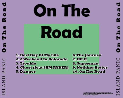
After we had created our music video next in the brief was to create a digipak. We already had an understanding of what was going to be conventional for our genre. It is important to stick to our genre to keep our audience engaged and give them what they should be expecting.  We wanted to represent the indie pop genre on the front cover especially therefore the audience would look at our cover and know what they were looking at was an indie pop digipak.

We evidenced De Saussure’s signified and signifier rules to do with the denotations and the connotations for our genre. For example, a visual signifier we used is the main image of our band on the front cover of our digipak. This is conventional for our genre and fulfils the expectations and signifies what the audience should be expecting.  This signifies our band and the genre of indie pop.

Also while creating our digipak we evidenced Barthes codes for example the semic code embedded into our digipak would be the costuming.  On completion it was clear that there was evidence of Barthes semic code ideas for example in our music video it would be the positioning of the star image and the big colourful coast we used and the media language used for example Mes On scene helps give us insight to the characters this is what the semic code is used for.  These elements of media language represent and signify what the digipak is about, for example, the convention of the song titles in a sans serif font conveys the genre.

The way the st

ars are positioned we found a very relaxed pose which goes with the indie pop design we had in mind. We also wanted to make sure our stars were being portrayed as calm and at ease so they seem comfortable in the spotlight. This would be a star’s meta-narrative. For example, if we used an image where the stars were very close to the camera this may come across as intimidating and make the audience feel uncomfortable. The star and genre in our digipak were represented by the pastel tones used. This was to show the personality and playfulness of the indie pop genre. Also, the texts are playful but also have elements of simplicity to the project.  The audience could’ve easily rejected the text but our aim was to make it the same but also add our own elements to make them unique while also having the same amount of audience engagement.

We have decided from critical reflections and feedback we had received that at the beginning we were using unconventional serif fancy fonts that didn’t go with the genre or theme of our digipak. We also were using too many fonts so it lo

oked very miss matched with the stars on the front. Therefore we changed the fonts to sans serif which are contemporary and playful fonts as shown to make the digipak more exciting and less intimidating for the audience to look at. This will help them want to buy our digipak.

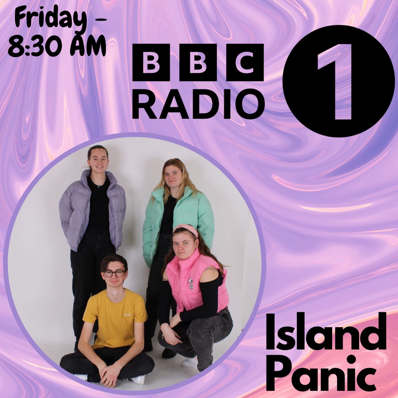
While creating our social media page we wanted as much engagement as possible from our audience. We used our media knowledge of our target audience and only audiences not only being consumers but are now prosumers.  Prosumers is what Gauntlett suggests about the audience and how the boundary between the audience and producers is now more blurred. (Shirky) Also how they are engaging more with the media we produce whenever. Producers now expect audience engagement in everything they produce.

For example, on our social media page, we put up a Doing our Q&A to engage with the audience fits into Blumler and Katz’s ideas about social interaction being essential in order to gain the maximum amount of audience engagement. Dryer argues that all-star images have their own connotations and their individual selling point. Whether this is style, branding or marketing strategies that separate them from every other product to do with the genre or artists similar to them, Dyer argued that as an audience we strive to complete the star image by consuming their products, shows, merchandise etc.

For example, in our digipak, we used colourful coats this helped us have our own unique selling point of having an array of colours on the front of the digipak. This is unique as other indie pop albums only have a couple of colours that are conventional for the themes involved in their album.

We used the media language of social media for example the fonts and the tone of voice we used in our post introductions in hope of maximising the audience engagement by providing them with the information they would want to be hearing and by giving our stars a personal identity that is relatable to them. We then used this Q&A on our Instagram story to come up with questions for our Radio 1 interview which we staged and produced ourselves.  Another way we made sure to get our audience engagement up on our social media page was by having an interactive questionnaire  poll that meant that the viewers/ audience could choose between 2 items. For example, we used it for our merch to ask our target audience and followers which colour t-shirt/hoodie they like better.  This makes the audience feel connected to the star as they were asked their opinion on a product the artist is going to release.

The semic and narrative codes of the thoughtful positioning in the digipak as well as the cultural codes of the wildlife in the music video contrast well to the genre with it having a sense of nature which is heavily indie-based but also having the traditional band of 4-5 in our bran which is more down the route of our music video. The cultural code of the setting is all examples that would term the narrative code. (Barthes) Our audience is able to decode the idea of our brand and why we have visualised the band in this way. We know already from previous reflections that the majority agree our conventions are clear to the correct genre.  We promoted our products on both our social media pages in multiple ways for example; BBC Radio 1 (Bathes) interviews, posters, websites, merchandise, stories and Q&As about the tours and products coming up.

Digipak Final Draft

After we had received feedback and reassurance from our peers that our digipak conveys key conventions of the indie pop genre we had been designing for this gave us confidence and also relevant ideas for our final draft. 

Here is our final draft of our digipak:

Please click on images to see PDF’S

After seeing our Digipak in the album cover holder we decided that the back cover was very simplistic and also had an irrelevant colour that didn’t go with anything else on our digipak, neither did it go with our star image. So we decided to go with the name of our album and tie in the name to the design. Therefore we created a road down the middle of our digipak. This gave our design individuality but also gave our digipak a key feature on any indie pop album cover which is artwork. We wanted to go with more of a playful and bold theme which also went with our music video theme to tie in the digipak together. 

We decided on the back cover we liked the text, however the colours didn’t look right with the new changes we made, therefore we changed these colours to match the road so that it blended nicely with the colours inside our left and right covers. 

My group is very proud of what we have produced and believe it follows the true convention of an indie pop album cover and digipak.

Music Video Final Draft

This is our final Draft for our music video:

As you can see below we have now finalised and published the last draft of our music video. Our music video we hope and believe is entertaining, conventional and genre supportive for our audience. We hope we have given the audience both what they are expecting and more from this music video. 


Our music video is inline with the key repertoire of elements in a traditional music video for example; lip syncing, editing to the beat, transitions, jump cuts, different camera angles, a variety of shot distances, range of location and good MES. We included these key conventions in our music video to make sure we understand what the audience are expecting, without including the repertoire of elements we would be at risk of the audience rejecting the text and not watching or liking our music video.


To be ‘ the same but different ‘ in our music video we used heavy MES in our performance. This was a risk as we hadn’t seen it much in our genre before however we were confident we could make it work for our target audience. We used both narrative and performance however due to our long storyline we now agree our music video is more narrative based then performance. However upon reflection if our music video was narrative heavy then the storyline would not make sense and the audience would reject the text. Both our narrative and performance had very different structure and costuming however we believed this to have worked well. 


The stars are represented as extraordinary as Dryer proposed in his theory as they are seen as strong confident and playful individuals in the performance with the bold and eye-catching shirts portrayed. The stars in the narrative (the animals) are seen as sad and helpless until the girl helps them get back on their feet playing with her and having fun as their home is not being destroyed.


Our group is happy with our music video and what we have produced and are confident it is how we want it to look. We believe that it follows the traditional conventions of a pop music video as well as adding our own takes when possible. We enjoyed this project and hope that our audience will enjoy it.

Digipak Draft 3

Below is our digipak draft 3 in a cover, this makes our music video more conventional and reaslistic and ahs also helped us decide what works well while all of the images are together.

In order to get a new form of feedback for our draft 3 we decided to do a survey. We asked 22 people what genre they thought our digipak was. As you can see from the tally results, the majority got the correct genre. This shows our digipak is easily established as an indie pop digipak and that the design is evident to the genre. However because we still had a few wrong genres this shows us we may need to tweak some of our digipak to make it more conventional. For example in order to establish it is a indie-pop digipak and not just a pop digipak we are going to add a couple more designs and less images as images go more with the pop conventions rather than indie pop.

Social Media Page Draft 2

Below you will find our teacher feedback which was sent to us via a screen castify.


Here are the new thhings we need to include in our social media page in order to make it better:

  • change and make the photos more interesting as they are a bit dull
  • Add in more introduction to the posts
  • More obvious merchandise link
  • Picture of band member used elsewhere
  • put in a Tease for front cover of album
  • TLC with aesthetic of posts
  • try to create a Guerilla marketing campaign
  • Tour dates need to be released
  • try to include some Synergy
  • Performing somwhere else
  • Tour dates and tickets on sale and link to these
  • try to use Cross media convergence

Digipak Draft 2 and teachers feedback

This is our digipak draft 2


Here is a screen castify from out teacher on our Digipak

Teacher feedback

  • Add shadow to enhance the models
  • she didn’t like the ‘Island Panic’ font
  • break up colours so change strips
  • Swap right pane as goes down the other way
  • Change the font of track list
  • Finish list of lyrics on the inside left and right
  • Change colours inside as too flat doesnt lift off or show the genre very well
  • Make inside more interesting as it is dull and timid
  • More noise on back to make it pop
  • Chevrons on the back? is an idea

Social Media Page Draft 1

This is the first draft of our social media page, so far we have included an array of work such as:

  • Cross media convergence
  • synergy
  • gurilla marketing
  • interactuve website
  • interactive stories (polls and Q&A’s)

Here is a slideshow which includes al of the posts as well as the stories, audience engagement and synergy we have included in our social media page so far.

This is our draft 1 of our social media page

By refelcting on our first draft of our social media page we will be able to include more of the areas of a realistic social media page we are missingn currently. This will make our social media page more realistic and make our star image’s profile believable.

For example we want to include a radio interview clip and advertise this new way of promoting our artists and our album.

Digipak Draft 1

This is our first draft of our digipak, we have created first drafts for our front cover and back cover of the digipak. Due to this being the first draft we have a lot of adjustments to make to guarantee our audience does not reject the text and that the product is what they are expecting. 

Our genre is indie-pop, while doing the research tasks we concluded that with indie-pop bands they tend to have the band on the front as well as a visual artwork piece on the back. We are unsure fully on our design however below is what we like about this first draft:

What we like:

  • Pink tones 
  • The font of the album name 
  • The layout of the text 
  • The image 
  • The green 

Improvements:

  • Blue tone on the back cover 
  • The font of the song names 
  • Add a barcode by the copyright 
  • Change the spines 

By establishing the changes we need to make we can make sure we make a successful digipak that is more conventional for our genre.


Timeline and Marketing Ideas

In order to stay organised and on top of our work load, we created this poster with post it notes. The post notes are in order of when we will post each post. We first started by deciding what types of post we wanted to start with, we decided that having a group band photo was the most conventional for our genre and group for our genre. We then thought a good way to start would be introducing each member of the band including a studio photo of them and a natural more relaxed photo of them.


We have included ideals such as:


  • Story content 
  • Merch content 
  • Website content 
  • Polls 


These will all keep our audience engaged with our page.

Analysis of a Social Media Page

In order to understand how to create a successful and conventional social media page we had to research and look at an artist similar to our star’s social media page. We decided as a group instagram would be the most conventional for our artists due to the chill vibe of instagram and the layout and filters being conventional for our genre and artist. We chose to follow Zach who is a member in the band American Authors which is the band that our music video song is by and also the artists most of the songs we will be using on our digipak. 


We wrote a script in order to cover all of the key elements needed to create a unique but conventional page as well as thinking about what our audience would be expecting through the genre etc. We then put this script into a screen castify.


These are some of the key elements we wrote about:

  1. What is conventional about the page in terms of technical conventions (use terms).
  2. How does the SMP page encourage AIDA (Attention Interest Desire Action) through its design and content?
  3. How does the SMP page enable the audience’s Uses and Gratifications?
  4. How far is the SMP page a good example of integrated advertising and how far does it encourage it to go ‘viral’ and use ‘guerrilla’ marketing to help promote its star?
  5. How is the star represented – ordinary, extraordinary, present and absent


Part 1:

Part 2:


This task will be useful when creating our social media page as we now know key elements as well as important aspects, tools, filters and other ways to make our social  media page conventional and suit our genre.