Communicating My Brand

In Search of Design Ideas

All designers are constantly on the search for ideas they can appropriate (borrow) and incorporate (blend) into their own work.

You need to do the same for your magazine.


Pinterest

Go in search of picture, words, designs as well Photoshop & Indesign techniques  you think might suit your magazine.

To gather the images together use Pinterest, which allows you to pin your ideas to a board.  Call it ‘Magazine Moodboard’. You’ll need to install the Pinterest tool bar button in Chrome in your profile. This will give the ability to ‘Pin’ images you see in a Google search.

Find photos, designs, images from any manner of sources that you are inspired by and you could use as inspiration for your own magazine. The moodboard will be a reference to you as you design your magazine – it will remind you and redirect you when you are struggling for inspiration and ideas.

Use the following search terms in Google after the band names or artists listed

  • ‘Lyrics’
  • Gigs
  • ‘Album Art’
  • ‘Logos’
  • ‘Tweets’
  • Photos

Search also for ‘Design’, ‘Graphics’ and ‘Typefaces’ along with with the following #adjectives, which you associate with the genre – refer back to the wordcloud.

  • ‘Grungy’
  • ‘Urban’
  • ‘Raw’

Use adobe colour wheel for a possible colour palette and include visual denotations and connotations that embody your brand and visual design.

This is a link to my Pinterest board. You need about 50 images.

This is a link to a Pop inspiration board.

This is a link to an Indie Folk board.

Use INSTAGRAM for a source of fantastic images, ideas.
Select “Save” to create your Pinterest pin.
  1. Click the plus sign (+) at the top of your Pinterest profile. …
  2. Select “Create Pin” from the dropdown menu. …
  3. Upload an image file from your computer and add a destination link. …
  4. Enter a destination link from which to save an image from that website. …
  5. Title your pin


My Audience Profile

Media Theory Reminder

In order to create a magazine for a specific audience you should understand what makes them tick, especially what reasons they might have for investing their time and money in your magazine.

A couple of theorists who considered this were Blumler & Katz, who suggested that there were four reasons collectively known as Uses and Gratification. Their theory describes an active audience and suggested four reasons for people to actively seek out and consume media:

USES AND GRATIFICATION

Information Self education to suit personal needs; advice on practical matters; information on events or issues of personal interest; curiosity or general interest
Personal Identity Media reinforces personal values; models of behavior; content explored to challenge, adjust or affirm sense of self
Social Interaction Identify with others to gain a sense of belonging; find basis for real life interactions; substitute for real life relationships
Entertainment Escape; diversion; emotional release; filling time; aesthetic enjoyment

Audience Theory Extension

Below is a slideshow on Stuart Hall and his ‘Reception Theory’. Consider what he says about audience.  He argues that an audience decode a media text through the filter of several things:

  • Demographics
  • Psychographics
  • Situation
  • Cultural competence.

Media Theory Booklet

Here is the Theory Booklet with all of Hall’s ideas on Pages 11 and 12.

RECEPTION THEORY

So…what am I supposed to do with all this theory?

TASK – Create a dating profile for your…

Perfect Audience Member

My Research Process

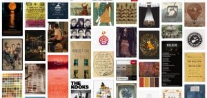
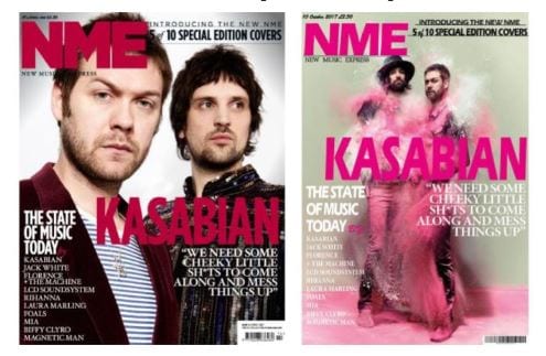
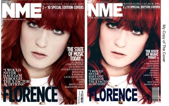
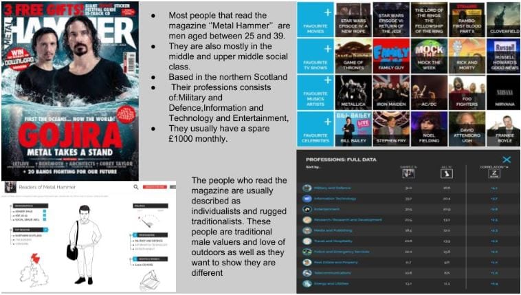
I have decided to make a magazine similar to Kerrang.

Of course I had to understand my audience and what media they consume and use this information to give me ideas for my inspiration search.

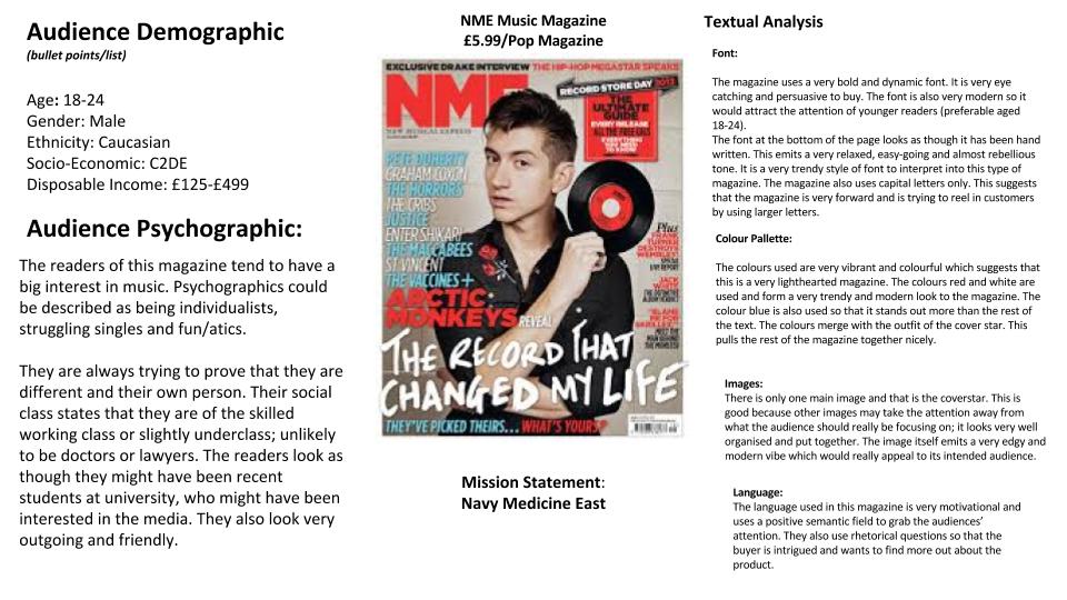
I looked at a number of back issues of Kerrang and used YouGov for artists that appeared on those front pages. I took snips of their audience’s demographics and their media consumption, particularly the other musicians/ artists / bands which cropped up. Here is my research on my audience and what media they’re into.

Do similar research for your target audience, and then decide on the following features of your audience:

  • Which other bands/artists your audience would be into?
  • What other media they would consume, fashion tastes, musical genre preferences?
  • What are their values, attitudes and beliefs they hold about what’s important in their lives and the world around them?
  • What demographics describe your audience?
    • Gender
    • Age
    • Education
    • Occupation
    • Marital status
    • Cultural background
    • What ‘communities’ do they belong to?
    • Where do they live, work and play?

HELP

Here is a handout we gave you earlier this year which describes different audience groups / communities which is helpful in reaching some conclusions about their values, attitudes and beliefs, and how to describe their communities and social groups.

Use Google slides to design a profile for your target audience which they might upload to a dating site.  You may want to use someone you know to model the profile on – although don’t use their name or photo!

Give your ideal audience an image, name, gender, relationship status, groups, status, likes, dislikes…all of this should be through the filter of music and should help describe your audience profile. Make it as detailed as possible – why not consider someone you know (do not actually use them) who likes the music, is a fan of that music/band and use them as inspiration.

Here is a template that you may wish to follow:

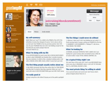
YOU MUST ALSO USE THIS WEBSITE: yougov.co.uk and mention it in your introduction or even better, take a snipping tool screen shot of the profile target audience for your performer.

KEY TERMS needed in your reflection

‘Preferred reading, encode, decode, oppositional reading, demographics, psychographics, cultural experience, uses and gratification, target audience, producer, target audience, entertainment, education, social interaction and personal identity etc.

Branding Ideas & Mission Statement

Task 1 – Which genre?

It’s probably best to choose a genre of music you understand, like and can get excited about.

That said, some genres of music have very specific conventions and might be able to provide you with much more scope for design decisions and copy style. If you are undecided perhaps choose a very obvious genre, such as punk or metal

Research various genres – you will be amazed how many sub-genres and sub-cultures there are. These are just a few.

Task 2 – Develop possible names for your magazine. 

Use a generator app or a thesaurus for simple, catchy and genre specific names for your magazine. For example:

  • Bonus, Fault, Exchange, Storm, Louder, Open Mic, Score, Epoch, Placebo, Audio, Stream, Hustle, Phonic, Whisper, N&U (new and unsigned), Orbit, Swipe, Double Tap, Like, Status, Plectrum.

Task 3 –Branding Ideas and Mission Statement

Create a word-cloud that includes all the words that relate to what might be your mission statement  for your magazine – its PURPOSE AND CONTENTS.  For example will you magazine feature: new talent, unsigned artists, fashion, concerts, festivals, be edgy, anarchic, energetic?  Address all 4 of the Uses and Gratification that Blumler and Katz talk about to ensure maximising your sales to ensure that your contents will appeal to their use of the text.  Include the name of the magazine in a different colour.

Here is an example word-cloud and mission statement from last year.

My Tour Poster

This is your chance to shine now. This is your chance to put all your technical skills with Indesign and your knowledge and understanding of how font, colour, images and language can help communicate a story.

BRIEF
A client has come to you with an image of themselves as a performer. Their style of music will belong to a particular genre. They want you to design a poster for an A4 page in a magazine, advertising and promoting their forthcoming tour. You must include the following:

  • Name of artist
  • Name of the Tour
  • Dates and Venues
  • Other information like: where the album can be bought/downloaded, tickets available from and prices etc.

Moodboard reflection:

Why not use this tour poster presentation as a start for inspiration or look at the previous presentation?  After doing your research, reflect on how the colour palette is used across various examples, reflect on the fonts used and use the terms conventional in your analysis.  Remember, you want your product to be ‘the same but different’ to be ‘conventional but unique’ so that your audience not disappointed.

Consider AIDA – attention, interest, desire and action.

Look at this presentation of CD covers that relate to specific genres and you will see how ‘conventional’ the colour palettes are for each individual genre.  Make sure you too follow the conventions but create an innovative and eye catching poster.

Remember,  doodle, muse and research before you open up your Indesign.

Poster reflection: How is it conventional? How is it unique? What about it addresses AIDA? What do you like about it and what didn’t work as well as you had hoped?

USE THIS SELF ASSESSMENT SHEET – TAKE A COPY AND COMPLETE AND EMBED IN YOUR POSTER POST

Selecting and Extracting Part of an Image

PHOTOSHOP

A key skill to learn in Adobe Photoshop is how to select an area of a photo.

You will do this to extract an element of the photo to be taken somewhere else or to apply an effect to that area of the image alone.

Or visit our Faculty of Arts website, where Serena has collated a simple ‘how to guide’ on how to extract an image from Photoshop to use in Indesign.   

or see the final page of this presentation for another way.

This is controversial, but you may want to ‘change’ the way your model looks.  Think about the impact this has and how it can relate to Media Ecology – can we really trust what we see today?


The Basics of Graphic Design

‘AIDA’ – The most important acronym!

Your print work should aim to:

  • ATTRACT THE AUDIENCE
  • ENGAGE THEIR INTEREST
  • CREATE DESIRE
  • CALL TO ACTION

TYPOGRAPHY = FONT

There are basic typography rules that you will need to know and basic colour combinations too – red on green?  too many fonts not from the same family? serif or san serif?

IMAGE COMPOSITION & PAGE LAYOUT

  • Think about composition and how the eye moves around the page.
  • How does the image integrate with the design elements on the page?

Follow these basic rules and you won’t go too far wrong.

Introduction to Indesign

Lesson 1 

Serena will take us all through the basics of:

  • INDESIGN – how to create a poster template, place a photo, add text, change colours etc.
She has created a great page on the Faculty of Arts Website to support you with InDesign.

Make sure this the first place you look at for answers to your questions.

Lesson 2, 3, 4 and 5

  • You will be allocated a specific edition of the iconic music magazine, NME (New Musical Express).
  • The aim is to recreate the layout and to recap on the main conventional design features of a magazine cover.
  • Using Indesign – recreate/copy the cover you have been allocated.
  • Each of you will create your own version but you can work with your partner in terms of sharing ideas for fonts etc.
  • You do not need to find the exact photo – any one with a similar grouping of performers or artist will do or in fact you can add in a box with a cross through it if you really can’t find one that will do.
  • The main aim is that you have some fun with Indesign – find the right fonts, play with the sizing, kerning etc and do your best to lay out the cover with a conventional layout.
  • Here are some suggestions for cover photos – see the first slide for caveats on what you will and won’t be able to do with them but it might save you time trawling the web.
  • Exporting as a JPEG and a PDF, uploading  to your blog and save as final draft in IDD.

Lesson  6

  • Remember to introduce the content (your mock-up front page)
  • Reflect on what you have learnt – how to use Indesign and how magazines have conventional features and name them – masthead, cover lines, main cover star etc
  • Reflect on how you did – find 3 strengths and 3 weaknesses.  What did you do well and easily and what did you struggle with and will need to improve?
  • Set yourself some targets by finding @ 3 self help YouTube tutorials for any aspects of Indesign that you struggled with and embed the videos in your self assessment post.
  • Make sure you watch them in full this weekend in preparation for your own album poster design next week.
    • Link in the online tutorials that will help you improve your use of Indesign next week.

Here are some examples from last year:


Textual Analysis of a Magazine Front Page

KEY TERMS: represent, connote, infers, implies, suggests etc

Task

Complete a thorough textual analysis of a music magazine from the previous class slideshow (some of the research will already have been done for you).  Choose a different one from the one you did an audience profile for.

The analysis should include the following:

1) A description of their target audience.

  • To help you, you should use yougov.co.uk site and the profiles section
  • Another way to help you understand the target audience (of a commercial media product) is to look at the adverts within it.
    • Not the ads on their websites, (those are generated by cookies that help web companies follow you and give you personalised adverts), but the adverts they put inside the magazine (if you can find those).
    • You should also refer to the attached audience segmentation document to help identify a suitable classification for the target audience.

2) You should also explain their brand, which is defined in their mission statement.

(If you understand the audience and the brand this will help you unpick the design. The designers and editors will have had the audience and brand at the heart of their decision making and so should also be at the heart of your textual analysis.)

3) Use the correct terms for the technical conventions when talking about the design elements attached to them i.e. the masthead represents, the plug language connotes, the cover lines font infers etc…..

4) Consider how those design elements are shaped to communicate meaning, which will reflect the brand and mission statement – look for the signs, symbols, colours, fonts, framing, MES, facial expression, body language, language etc that have been used to convey a narrative, to represent a genre, to sell a brand).

Here is an example from a previous student that includes some very detailed observations:

This is the format we would like you to follow and use the sub-headings included. Some of the sections can be bullet pointed or lists, but others will require some analysis to include the terms: represents, implies, suggests, signifies etc when doing a textual analysis.

Use this link so that you can take a copy of the slideshow and insert your own image and do your analysis.

Magazine Audience and Brand Identity

KEY TERMS:  DEMOGRAPHICS, PSYCHOGRAPHICS, SEGMENTATION, COMMUNITIES, TARGET AUDIENCE, USES AND GRATIFICATION – B and K

What is the first thing you notice about a magazine cover on the shelves? Image or Name (Masthead)? Probably both, but the image and the masthead are vital design features to catching the reader’s eye and standing out amongst all the other titles on the shelves.

Together they form an instantly recognisable BRAND.

You can see from these mastheads how different they are in size, typography, language and tone. They are clear codes and connotation as to what the magazine is going to contain, the genre or music and therefore attractive to a certain target audience – a certain demographic. This is its BRAND IDENTITY and should be obvious from the front page of the magazine.

Masthead and Brand Identity

Click to see a range of Music Magazine Mastheads

You will be allocated a music magazine cover from the slideshow and it is your challenge to do some research about that magazine’s intended target audience.

TASK 1

Using the yougov.co.uk site and the profiles section, find the magazine (or the band from the main cover line / image) and insert the audience profile by using the snipping tool.

TASK 2

Then do some research as to the mission statement of that magazine. (google it)

TASK 3

Use this audience segmentation sheet to see if you can allocate a certain group to the intended target audience of your magazine and explain why in your annotations.  You will have to apply your ideas.  Reflect on who the target audience is and the evidence you have for this.

You will have to research typical fans for any of the artists on the front cover or inside. This too will give you an idea of who the audience is.

TASK 4

Embed the slide in Audience Profiling and reflect on what you have done, why you have done it and where it will take you.

Resources

Your teacher will share an editable class copy of this slideshow in classroom for you to to complete one slide of.

Form & Conventions of a Magazine

The Design Elements of a Magazine Cover

KEY TERMS: Technical conventions, expectations, typicalities.

You need to learn the TERMINOLOGY to describe EXAMPLES of print design. You need these terms to:

  1. ANALYSE professional examples
  2. ANNOTATE ONE FOR technical conventions

Here is a film magazine with the main design elements labelled.

Now in pairs, photocopy one cover of one of the current music magazines onto A3 paper and annotate it with all the relevant design conventions labelled.

You will then take a good photo of it and upload it to your blog.