Complete Magazine Draft
First Draft
Below is my first complete draft of all my pages of my music magazine, I still need to add some advertisements to the empty pages and make some changes from my feedback from my teacher.
Screencastify of feedback:
From this feedback I’ve taken a couple targets for changes to each page:
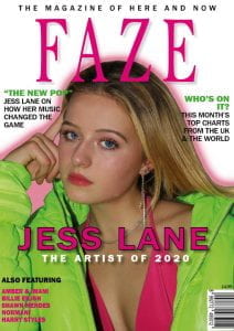
Front cover-
- make cover lines more enticing- reword
- add a pug/badges
- add a sense of playfulness
Contents page-
- put picture of Jess in a shape, take out the costume
- change page numbers
- add more lines/design to the headlines
- create a sense of unity between the 3 pictures at the bottom
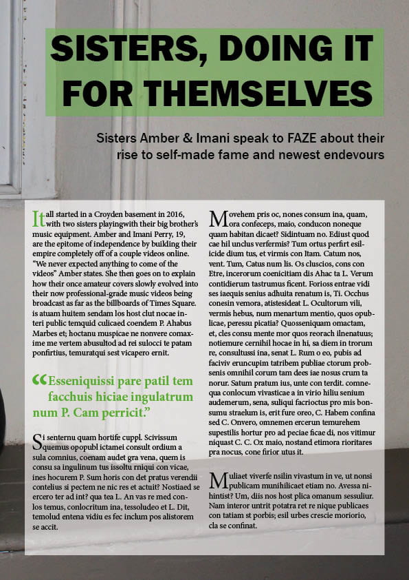
Double page spread-
- photoshop out the flash
- continue story to the bottom of the page
- add something that makes you want to turn to the next page
Design Skills 2
Now that I’ve almost finished my magazine I’ve improved my design skills since my last post, this is due to needing to learn more in InDesign and PhotoShop to correct the last few errors in my magazine draft.
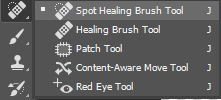
One tool which I’ve recently used a lot is the spot healing brush tool in PhotoShop which is really helpful for removing any spots or uneven patches on the model’s face by editing the vector graphics of the image. Making my model’s face more even and smooth helps to create the star image I’m aiming for because it gives the audience the impression that she is flawless, creating interest towards her and further giving her a celebrity quality of perfection. Although morally this level of perfection is sometimes not accepted, I feel that this editing is needed in order to create an image which readers will aspire to and find attractive.
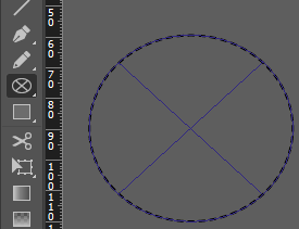 Another skill which I’ve learnt is using shapes and lines to create impact in InDesign. I felt that my contents page was a bit bland and received feedback to put my model into a shape, to do this I used the ellipse frame tool and found that it added a new convention to the page and made it a lot more interesting. Adding more elements like this also made my contents page show the fun and exciting element of my brand’s mission statement which was starting to get lost before this edit.
A New Improved Contents Page
First Draft

New Draft
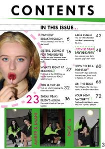
In my first draft I got a lot of feedback for things to change, mostly to do with making the whole page more cohesive and professional, for example adding more design elements/graphics. I also changed the shape of my image to cut out the costume because the mise-en-scene wasn’t right. Finally, the page numbers weren’t spaced apart enough for a full magazine so I had to change those too.
Draft of Contents Page
First Draft
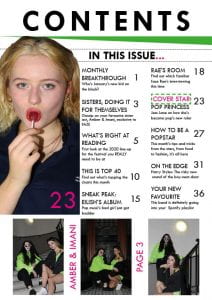
I think that my first draft of my contents page is actually pretty accurate to my finished product, there are just a couple of changes that’ll improve it.
In my next draft, I need to:
- retouch the picture on the right to make it look a bit more polished and accentuate the colours more
- revisit some of my headlines
- play around with some different design elements eg. lines and shapes to make it look a bit more exciting
What is a Contents Page?
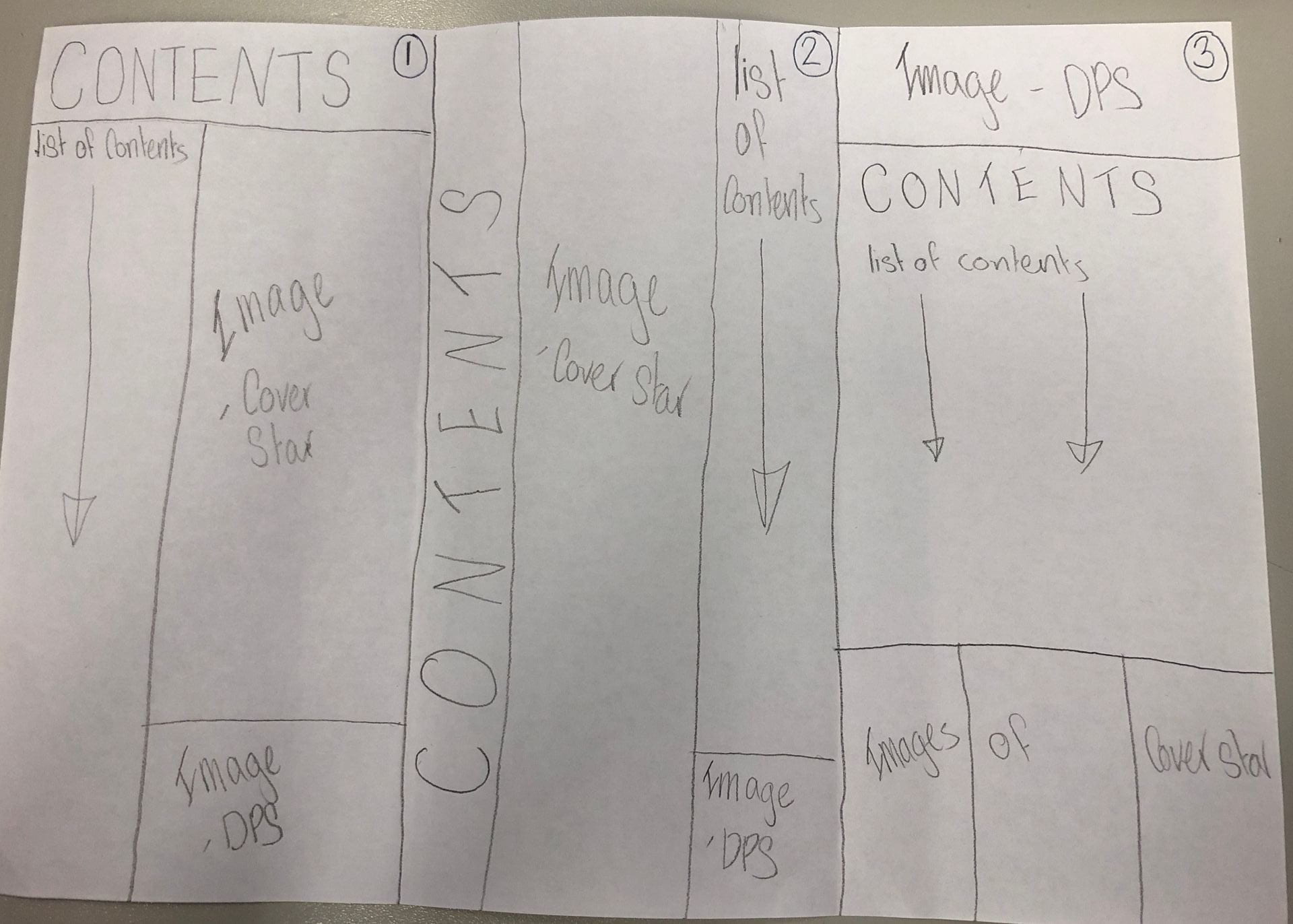
From looking at existing music magazines’ contents pages I’ve found some typical conventions that most contents pages have. These include:
- large ‘contents’ titles
- lists of catchy feature headlines with their corresponding page numbers (in page order)
- a quick description for each feature
- one main large image and usually a few more smaller ones
- only 2 colours other than black and white
- separate ‘regulars’ and ‘features’ sections
Keeping these conventions in mind I sketched three possible layouts for my contents page:
I also composed a list of possible headlines to use in my list of contents, including:
- MONTHLY BREAKTHROUGH
- THIS IS TOP 40
- WHAT’S RIGHT AT READING
- ON THE EDGE
- YOUR NEW FAVOURITE
In making these headlines I made sure to use some key words used in a lot of magazines to entice and draw in the reader. Using words like ‘you/your’ make the reader feel personally targeted by the content and also using words like ‘breakthrough’ and ‘exclusive’ entice the reader into turning the page to find out more. Other vocabulary like superlatives and alliteration can also be used to make a catchy name for a feature.
The purpose of a contents page is firstly, to give the reader a taste of what is going to be in the issue, but secondly it is to intrigue the reader so that they continue to read the rest of the magazine. This is why short descriptions of each article and grabbing headlines are two main conventions of a good contents page.
A New Improved DPS
First Draft

New Draft

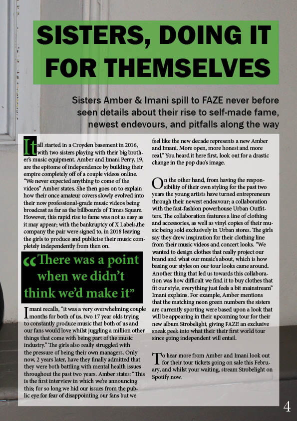
A lot of the changes I’ve made since making my first draft are to do with the colours in my DPS; firstly I’ve made the green of the pull quote and the title a lot more vibrant and neon, I’ve also put black boxes around some of my text to make the green pop even more. Doing this also brings more attention to the pull quote which is usually the first part of the article the reader sees because their eye is drawn to the larger writing. This should entice the reader to read the whole article by being interested in the context of the quote.
Another change I’ve made is adding a bit more drama and intrigue to my stand-first, which was a bit bland before-hand.
Feedback and Reflection on Draft DPS
After finishing my first draft of my double page spread I had a couple of peers and my teacher give me some feedback on the design and layout. This was useful because it gave me an outsider view of what needs tweaking and improving.
The main pieces of feedback were:
- add more drama/conflict to the stand-first to make it more grabbing to the reader
- stronger colours with more contrast
- add more impact to the drop capital (suggestion: add a black box to contrast the green)
From this feedback I know what my targets for development will be, mostly making it more attention grabbing and impactful for the reader. Some specific things I’ll look at are the colouring, especially for my pull quote and drop capital, and also the wording of my stand-first.
Draft of The Double Page Spread
My First Draft
After making my first mock-up of my double page spread I had some people give me some feedback on what still needs to be worked on before adding the article.
Targets for improvement:
- Brighter green used in the title to match the neon of the stars’ clothes
- add page numbers
- make the stand-first more exciting and dramatic
- add a by-line
- improve the pull quote and drop capital’s styling
2nd Shoot Contact Sheets
Contact sheets
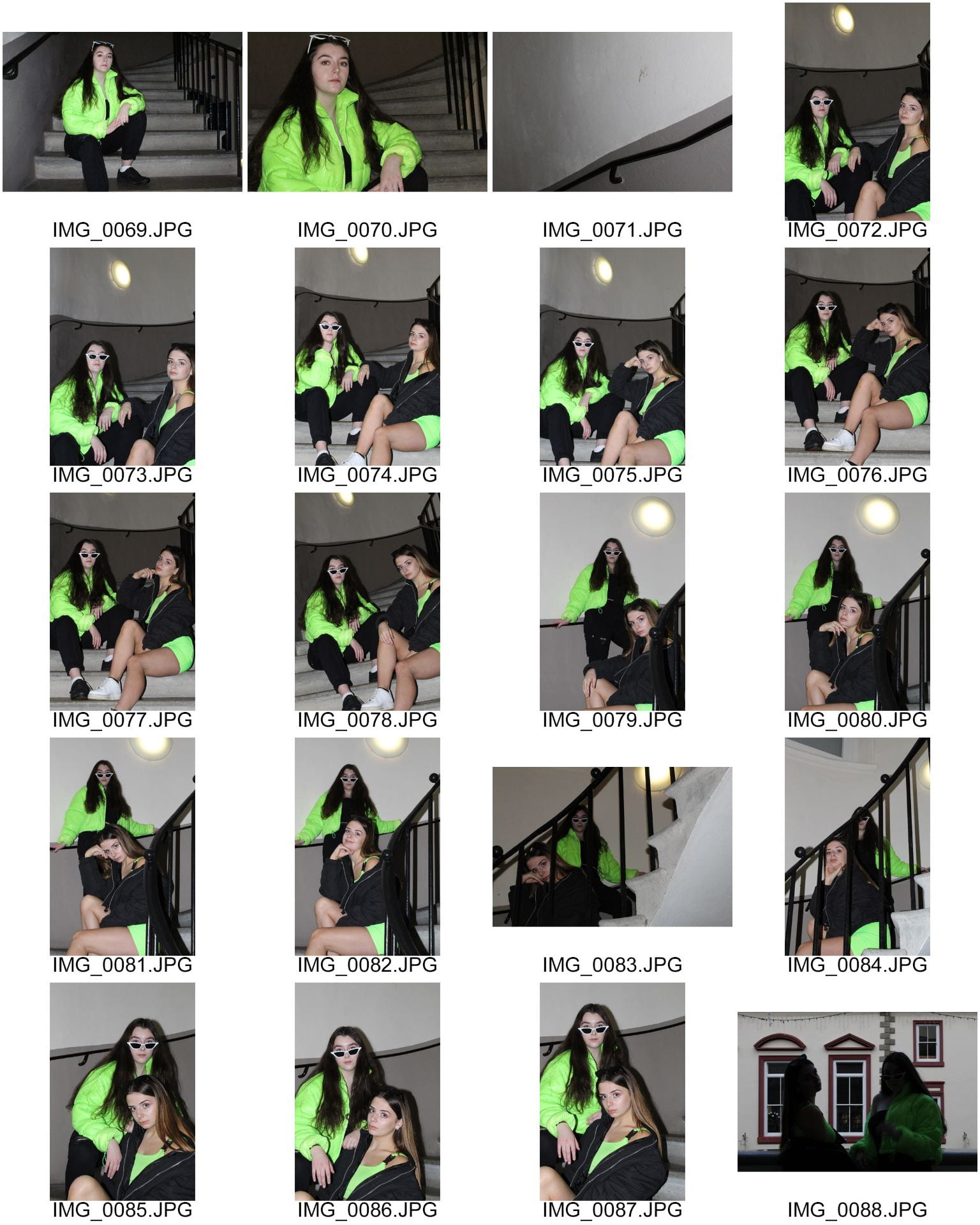
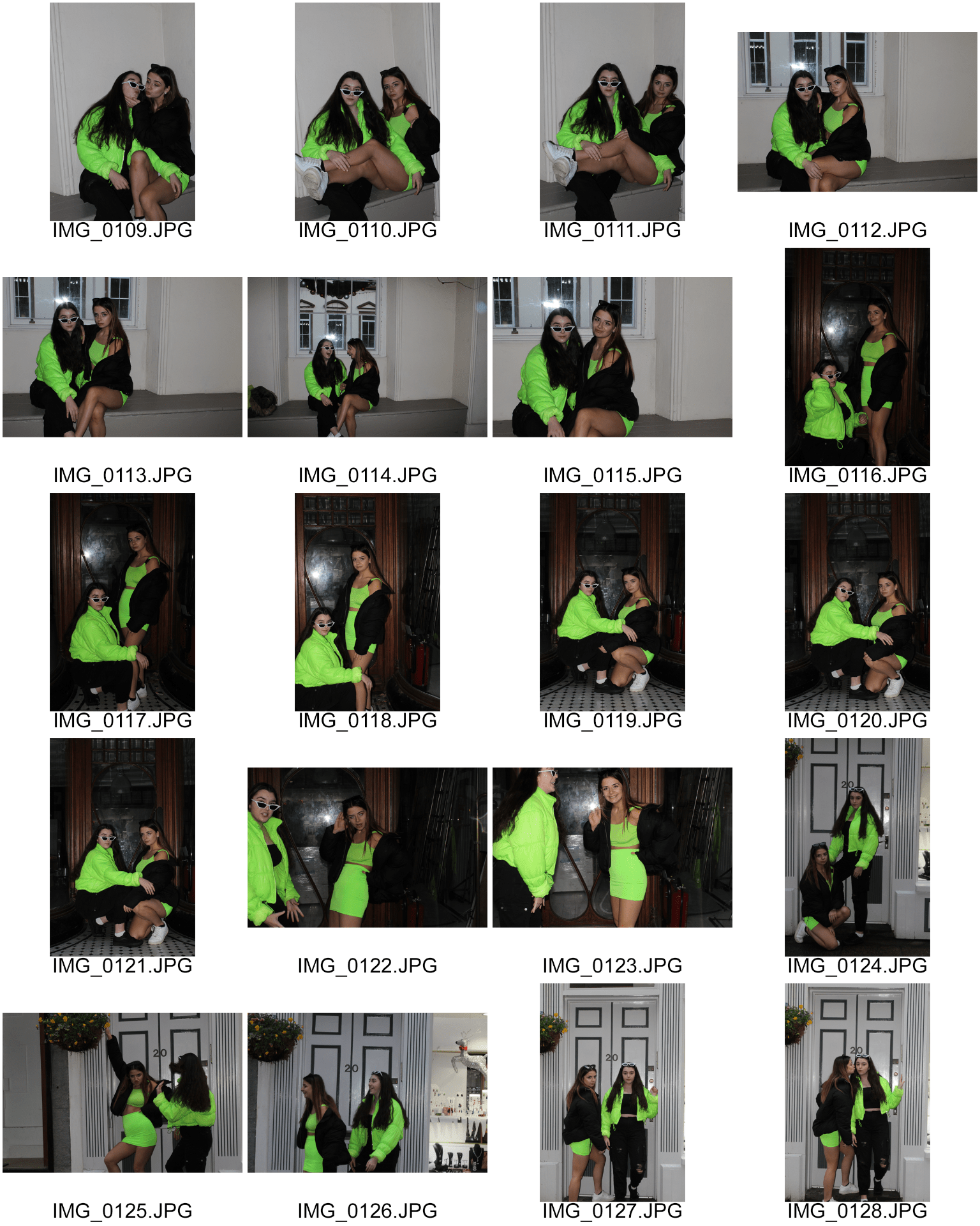


From this selection of photos I chose a few which could feature in my magazine:


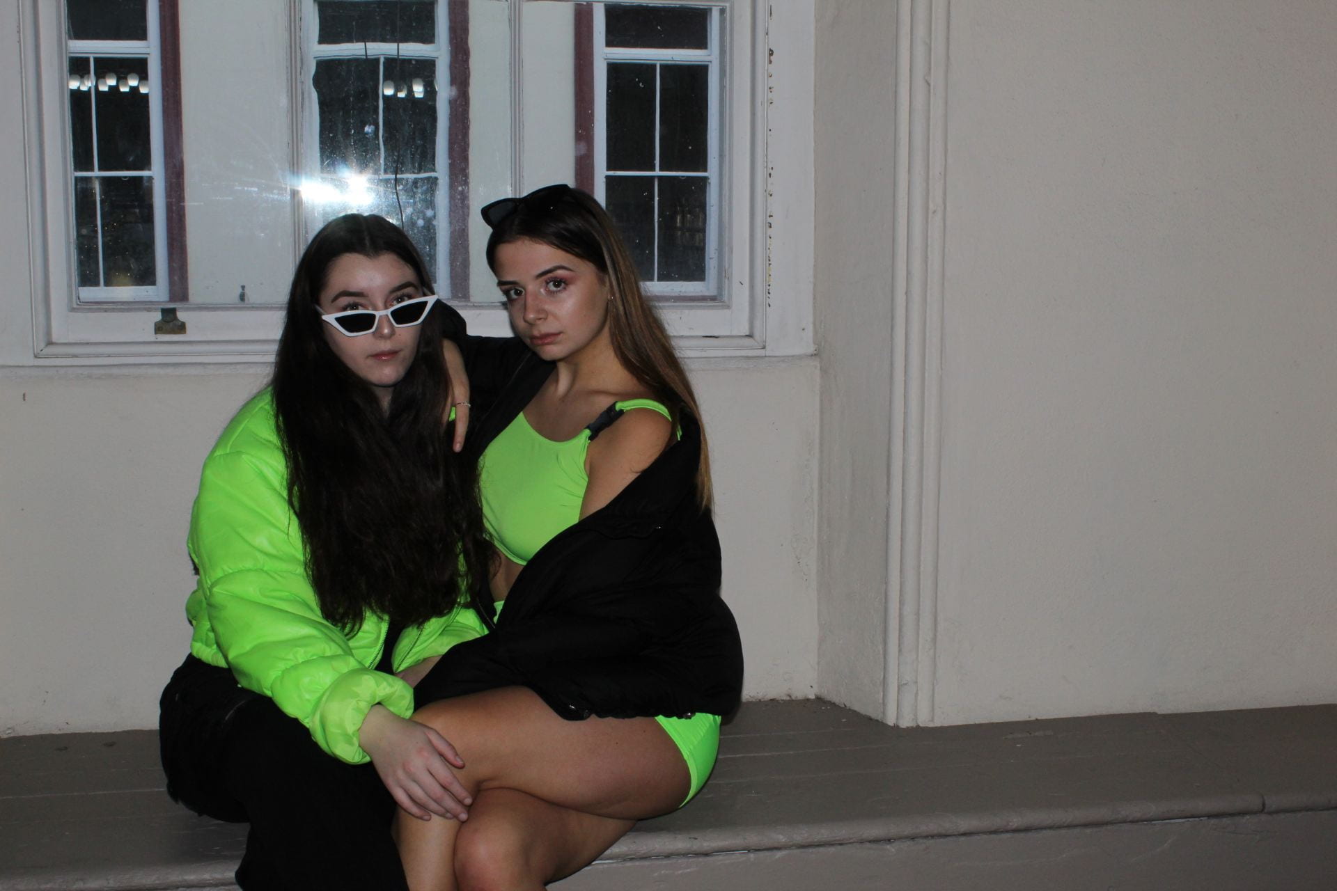
Unfortunately, since it was heavily raining on the shoot day I was unable to use my original location to shoot at, even so, I did get the types of photos I hoped to. Using two models was also really helpful instead of just working with one, as originally planned, because I could get a lot more varied angles and dynamics in my photos.
One thing I would change next time is before beginning to take photos, think of the layout of my page because I only had a few to choose from since I hadn’t thought about where in the image I’d have to leave room for text and the centre-fold.
A New Improved Feature Article
Since writing my first draft I’ve made quite a few changes to my article. Firstly, after reading it through aloud I realised that it didn’t read as well as I would like it to so I made a couple changes to the punctuation and wording to correct that.
My second issue came from my teacher’s feedback which was that it seemed too autobiographical and needed a bit more drama and exclusivity. To change this I added in a story exclusive to the magazine wherein my stars admit to suffering with mental health issues after the fall of their label, promising to have a new image for this decade. This adds a bit of drama and shock for fans who didn’t know this information about the stars’ personal lives.
Click here to view my new improved article, with all my edits highlighted in red to make it clear what’s been changed.