Question 4: How did you integrate technologies (software, hardware and online) in this project?
This is my infographic that answers question 4. I talk through the process of making my magazine through the different stages and different technologies (hardware, software, and online) that I used.
Question 3: – How did your production skills develop throughout this project?
Here is my MP3 recording of the letter:
Transcript:
Hey, I am Katie Fellows, and I am taking Media Studies as one of my A levels. This letter is for you to get a better understanding of the course- what you will learn in it. You will be expected to learn the basic properties of a camera, and how to use a range of software programs (like Adobe Indesign, Adobe Photoshop, and Edublogs). Production skills are made up of 3 main skills, which are called technical, creative, and transferable skills. These skills are used to portray specific genres, conventions, star images, fonts, and brandings.
Within this subject, you will develop many technical production skills. You will have to keep a record of your work via your own media blog- which will involve making posts, embedding items, and linking documents. Then you will learn how to create filters, edit photos, add backgrounds/ effects, and use a range of fonts through Adobe Indesign and Photoshop. Technical production skills also cover how the camera and lighting work (the shutter speeds and apertures). These particular skills will impact the target audience based on how the star image is represented (how it fits the genre).
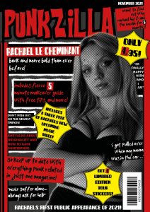
For example, I decided to change my main cover stars image in photoshop, so that it was in greyscale (black and white), instead of colour. I think that by doing this, my model stands out from the text more. It also helped me control the number of colours on the front cover so that there are no clashes. I feel that the colours being more grungy creates a stronger link to the punk genre. Although I liked this effect, I did have to be careful (and make it weaker) because otherwise, it would look over the top and cringe.
The creative production skills help you learn about your magazine’s branding, graphic design, composition, and MES choices. Basically, it covers masthead designs, font choices, colour schemes, page layouts, depth of fields, and rules of thirds. All of these are important for me to produce an effective and well-thought-out product that suits my target audience. In particular, the make-up, hair, props, setting, face/ body expressions, and lighting are what impact my models’ looks the most. They have the biggest impression on my genre of punk. Furthermore, making my cover stars’ representation of punk stronger for the audience to see.
When I did my own photoshoot, I gave my model accessories to use as a prop. For example, I added sunglasses, a guitar, and some lollipops, so that they would feel more relaxed. It also helped my models feel (and look) less awkward. We managed to achieve different poses, like turning to the side, or facing and looking straight into the camera. By doing this, they became confident and portrayed the confidence of punk artists display. For the outside photoshoot, the wind and background textures helped give the photos an edgy vibe.
The transferable production skills are things that I have used, learned or improved during this course, that I can now use elsewhere in life. A few examples of these key skills are; organization, time management, research, listening, software skills, and self/ peer feedback. For my research, I used different platforms for different things (like Pinterest for mood boards, and social media for communication, advert choices, and finding the right target audience). Using a range of software and apps helps to get a wider spread of information and research- which will ultimately only improve my designs.
I created a production meeting agenda to organize my main photo shoot before I had to do it. This ensured that I knew the correct timings, settings, lighting, camera set-up, props, and costumes beforehand. This also helped my models prepare what they needed to bring, ahead of time- therefore making the preparation stage a lot easier and more efficient. Having all the conventions that my magazine needs will improve my main cover star’s image and the final outcome of the product.
Overall, I think that Media Studies is a great subject for anyone who’s creative, or wants to work in the design industry. This course would not only develop your skills, but it would also give you an insight into how/ what software the professions use. So, if any of the topics above intrigue you, I would recommend taking Media Studies A level.
Question 2: How does your product engage with audiences and how would it be distributed as a real media text?
My screencastify:
Transcript:
Introduce your magazine, name, genre…
My magazine is called punkzilla. It’s a bright, quirky, exciting magazine that fits the aspects of the punk genre.
Describe your brand values/ quote your mission statement?
My brand values quality over quantity. Its aim is to raise awareness to punk- and fit the stereotypes the genre has. It will help individuals embrace their individuality and personality without feeling ashamed. This is different from many other magazines that only reference punk as its stereotypical traits, such as being; “bratty”, “rebellious”, and “aggressive”. My magazine’s cover stars willlook and talk like other punk magazine cover stars. This will help to show what theme the pages have.
Who are your target audience?
My target audience is primarily men or women in their 20s. This is based on my research, which showed me that it’s the younger generations who prefer punk music/ style. Particularly, men have the highest listening views to popular punk bands (like 5SOS, Kiss, and My Chemical Reaction).
Why would that audience buy your magazine?
This audience will buy my magazine because they will be interested to read about mycover stars, hidden secrets and stories. They will want to relate to them, and will have felt similar things. It will also encourage them to embrace punk. My magazine will be good for any newbies that want to find the best artists and concerts going on at the moment. The overall aesthetic of my magazine eis very fitting and eye-catching. For example, my big masthead typeface clearly draws the viewer’s attention to the word “PunkZilla”. Then the clothing and props that my main cover stars wearing/ holding will convey the theme of rebellion and quirkiness.
Who would you want to work with to distribute your magazine?
I would like to work with KERRANG or NME magazines. These companies are well known and regularly publish punk themed magazines. So they would be a great way to increase sales and popularity for a new magazine/ brand. My magazine is similar to their older publication so it would fit into their image. The radio station links are also probably the same as its the same genre of music.
What sort of advertiser would you hope to attract?
I would either like to attract a makeup brand that sells bold eyeliners, bright eyeshadows and striking lipstick shades. This would be a good advertiser to use because it fits my magazine’s make-up tips/ styles page. Or I would like to advertise with a jewelry brand that sells unique accessories, such as; necklaces, earrings and bracelets. These advertisers specifically link to my audience because they help everyone accessorize differently. It also helps create the unique image that punk individuals have.
What strategies do you have for distribution? How will you link your print content with online content? Have specific ideas, examples, stats and facts to back up your proposals.
My strategies for distribution are to include many interesting celebrity gossip facts/ secrets, have a reasonable price it’s sold at, and include advertisements that are very popular. I will also have a website for my magazine which will include online content. That way I’m reaching two different audiences. The digital print will have similar contents and layouts that link to my magazine. They will be able to access the online content via a code.
Question 1: How does your product use or challenge conventions and how does it represent social groups or issues?
This is my answer to question 1. I made this presentation on Emaze. It describes the process of what I needed to think about before and during making my magazine. It also shows what conventions I used, that other magazines include too.
Every magazine has adverts. We have been told to include 2 adverts that we think our target audience would be interested in. I made my decisions based on the information I found on Google. This was because it’s a reliable source that has proof of people’s interests, based on what they typically interact with. These two ads are different from my original ideas (I wrote about them in my creative critical reflection). I changed my mind once I finished my magazine so that I could see the overall aesthetic and impression it gives off.
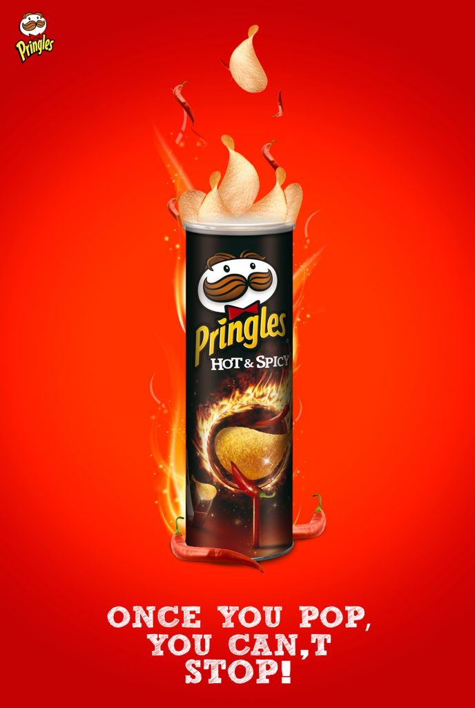
This is my first ad…
I chose this advert because I think the words “hot” and “spicy” can be associated with punks and their personalities. I also think punks would enjoy fiery snacks. So I think this advert would be something they would be interested in. I also think that Pringles are a very popular brand, that most people have heard of. This advert is also very bright and fits my magazine’s theme. It fits with my mission statement- of wanting to empower and encourage young people to embrace their likes and dislikes. Pringles hope for people to socialize whilst sharing a snack they all enjoy. This product/ brand is easily accessible, in supermarkets or online.
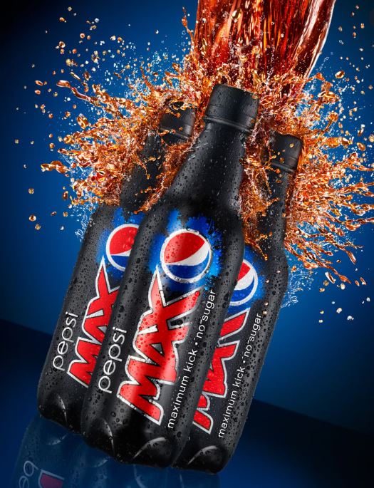
This is my second ad…
I chose this advert because I saw on google that many punks like Pepsi max. I thought that having an advert they enjoy would entice them to buy from the brand even more. It would also persuade punks that haven’t tried Pepsi max to try it (since others like it). I think punks focus on their looks so having a diet drink might be something they feel safe with. It may also make them feel more comfortable in their body. This is the website/ headline that I found which supports my advert decision.
Focus Forward:
I think these adverts are a good choice. They aren’t rough and violent items, however, they are saucy and popular. They are typical items that punks would buy very often. These will help tie my magazine in with my theme, whilst connecting with my audience. It will also mean that the brands will get more sales due to them getting more publicity. I decided to change my first advert ideas (eyeliner and sunglasses) as I don’t think they are punky. I also don’t think my target audience is as likely to buy them. Food and drink are also more commonly bought/ popular.
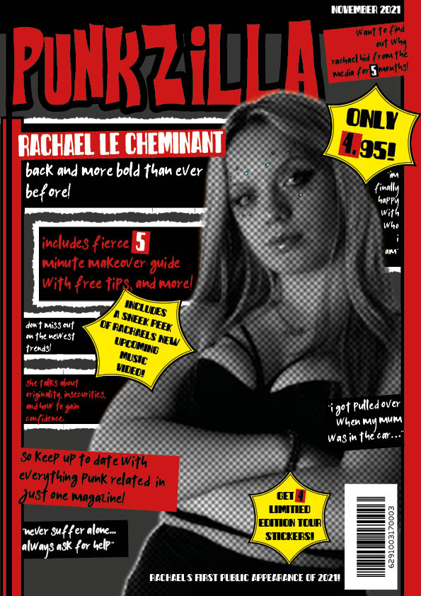
I’ve changed some of the fonts I used on my front cover. I changed from a decorative font to a sans-serif typeface. I did this because I think it made it look more interesting. Otherwise, I think the decorative font is overused.
I also made some of the cover lines bigger to fill more spaces on the front cover. My goal for my first page was to make it busy and vibrant. I wanted to make it stand out so people’s first impression of the magazine would be good, and it would make them want to buy it.
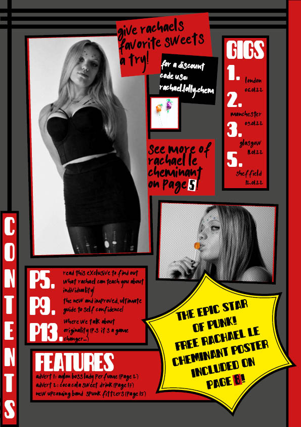
Contents Page:
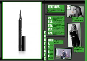
I changed the colour scheme from red to green. I did this so that the pages don’t all look the same. I also think that green is another punky colour.
I changed the layout, I moved the pictures and text boxes around. I also added another picture of Archie, so that my contents page didn’t just showcase one star.
Another thing I changed was the yellow plug. I think that getting rid of this made the front cover plugs stand out.
I also changed the page numbers so that they go to more pages.
Double Page Spread:
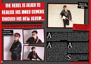
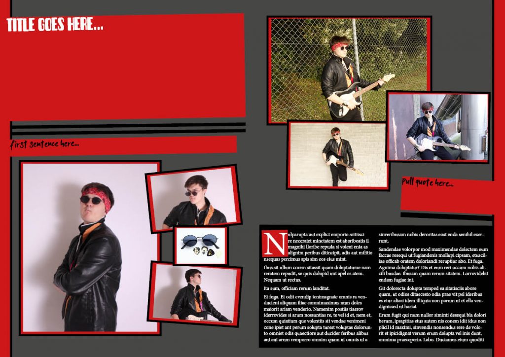
I added some drop caps to my article. This made the paragraphs stand out.
By adding the drop caps it also made the writing bigger, so that it fits the designated area better.
I changed the plugs to one single plug (on the single photo of Archie). I did this because I didn’t like the text on the second plug.
I moved the text box from the middle of the 3 images to the left side so that I could make the photos bigger.
I adjusted the font of the article text to a subtle, easy-to-read serif font.
Teachers Feedback:
The improvements I will make:
Front cover:
I will add a pound currency to the price box.
Contents Page:
I will get rid of the features box and make the page box bigger. So that it can still fit the same amount of information in it.
I will change the gigs guide so that it’s spread out over a group of pages.
I am going to increase the page numbers even more (to approximately 100 pages).
I will add the rough cuts, that I used on my front cover, to the edges of some of the photos and texts.
I want to move or add something to fill the space in the bottom right corner.
Double Page Spread:
Similarly, I will also add rough cuts to more photos on the double-page spread (as long as it doesn’t look too much).
I would like to change the second or third photo to a close-up. This is because I don’t have many close-up photos on this page.
I am going to try and move my group of photos around so that I can move the accessories plug into the middle again. I will do this because I think it makes more sense.
I need to change the photoshoot plug to something else. Something that describes who Archie is and why he’s famous.
I am going to make the second, third, and fourth drop cap smaller so that the first paragraph stands out the most.
Another way I will be able to make the first drop cap stand out will be to change the font. This way the article will include the same typeface that the title has.
If I can, I will move the quote into the middle of the article. This will make it look like it’s part of the article, and not just a cover line.
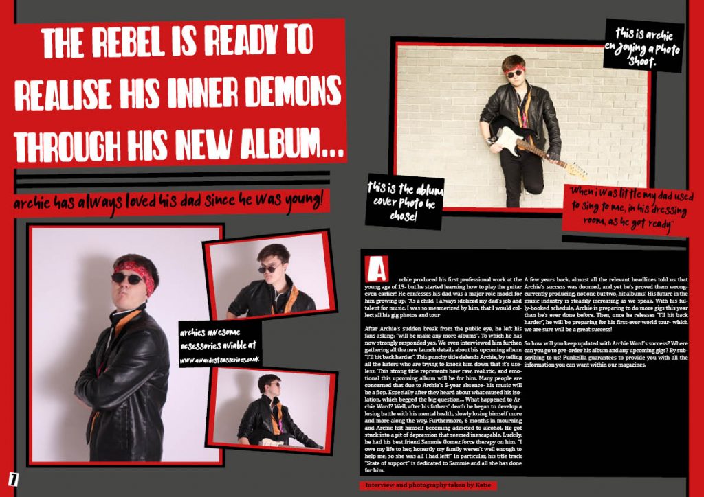
I added the title and article to my double-page spread. This was critical to add to my magazine. It gives the audience information about my chosen star.
I also added more captions to my photos, this helps the audience understand what the photos are, and the relevance they have to my article/ magazine.
Significantly, I also narrowed down the photos I wanted on page 8 to 1. This makes the 1 particular image stand out. I decided to do this, in order to follow the feedback I was given
What’s next?
I am going to make the texts align left- especially the title. I will do this because I think it’ll look better. I might also make the title bigger.
I will try moving the text on page 7 and making the two smaller images bigger. This is so that I fully use the spaces. I could also move them down a bit (to fill the gap).
I also really want to make the only image on page 8 bigger. I needs to stand out against the article.
I may also add something to the end of the article, where there’s a blank space.
Again. I adjusted some of the yellow colours to make it look more complimentary.
I also added the same typefaces. This makes it look closer to being finished.
I added the same filter to my cover star, but made the opacity lower. I also left the colour of the lollipop filterless, so that it stood out amongst the grey.
Lastly, I changed the layout of my images slightly. I cropped and tilted my cover star, whilst adding some more text and a small picture. I think this made it look more punky, and the layout less exact.
What’s next?
I am going to make the writing underneath the gigs, the page numbers, and the features bigger. This is because they are quite small and hard to read.
I am going to change the red and yellow colours for something else, most likely green and purple. This is so that my magazine pages look different and unique. I will then also be following the feedback I was given.
I think I will also make some of the images bigger, to fill some of the extra spaces.
I have changed the fonts, from the basic serifs to the ones I found online. This made a real difference to the overall appearance of the magazine. It makes it look more detailed and professional.
Another major appearance change I made was to my cover stars image. I edited her in photoshop to make her grey and have a textured effect. I think this makes her fit into my genre better.
I made my title bigger. This is so it stands out more amongst other magazines in a store. It also gives a bigger meaning to the name- particularly the word “punk”.
The other change I made to my front cover was the yellow lines. I made them black, so that the yellow was only used a few times. This made it more eye catching and less tacky looking.
What’s next?
I am going to make the grey, textured filter on my model less obvious. Which will make it more subtle. This is so that the photo, and overall magazine, will look better quality.
I will also make some of the texts bigger. I think that I could fill the front page more. Which would give a more complex and filled appearance.
I might also move the top right text box lower down, so that I can make the title even bigger. This is because it’s such a main aspect of my magazine.
For my finished magazine, I needed to create a double-page spread using Adobe InDesign. I also needed to write the article that’s included in this spread. In order to produce a double-page spread that I like, I have put together a few examples of some professionals’ work that inspires me.
Self Assessment:
Click here…
What I like about my double page spread:
I like the ongoing colour pallet that I’m using because I think it’s effective and can be used to represent the punk genre well.
I also like the mix of photos my magazine has, now that I’ve included the locational shoots images. In particular, the guitar and rough brick textured backgrounds are my favorite parts of the photos since they convey the theme the best.
I like the way my articles’ text starts off with a bold drop capital- which is the same font as my headline.
What I need to do to improve my double page spread:
Include a by line,
Add captions to some of the photos,
Add Page numbers to the bottom of the pages,
Write my article, headlines, quotes, captions, etc…
Look into adding filters/ effects to my photos (like in my other pages),